Don’t underestimate the power of your company vehicle. Whether you’re running a single vehicle or a fleet, once you decide to put your company logo on it, you’ve got the potential for a moving advertisement!
Sky use their fleet as a key communication tool, regularly changing the creative treatment and messaging. Moving ads are great for building brand awareness, credibility, reassurance, conveying key messages and demonstrating key services to your target audience. And you don’t need the luxury of the Sky marketing budget either!
Whenever a client asks for vehicle livery, we ask where will the vehicles be seen and by whom? Will they be passing through residential areas, building sites, industrial estates, remaining in the locality or driving long distances?
As for key messaging, what does the client want to achieve with the vehicle livery?
Sometimes we’re asked to simply supply a logo and contact details to a printer, in which case they have control over colours, positioning, size of graphics and ultimately the finished look of the vehicle.
However, for just a few hours work and a bit of careful thought, a designer will make sure:
- your logo doesn’t touch the windows
- we use colours that are legible against the vehicle colour
- logo, strapline and contact details aren’t split across door frames and therefore become illegible once doors are opened
- colours and fonts are consistent with your website, promotional material, shop front branding etc
- positioning of logo, strapline and contact details are positioned around doors, indicators and the overall shape of the vehicle, so they’re fully legible
We always use the latest vehicle manufacturer’s line drawings and design your branding and messaging to fit. After all, your vehicle is representing your brand, your company and the customer experience.
There are 3 types of vehicle livery:
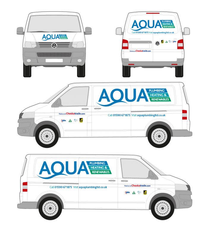
1. Basic Cut Vinyls – typically logo, website, contact details.
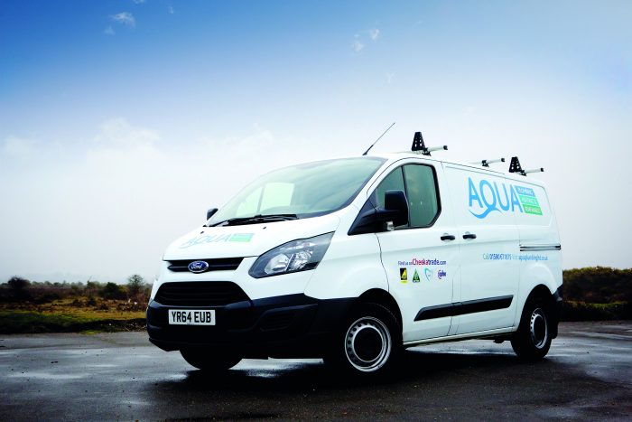
Aqua Plumbing & Heating Ltd – Fleet of New Forest Plumbing Engineers
BRIEF: To build brand awareness locally, offering reassurance, level of expected professionalism and key contact details.
RESULT: We used the van outline to design the logo placement taking into account van panels, door frames, lights, wheel arches, resulting in a smart, professional, well balanced design.
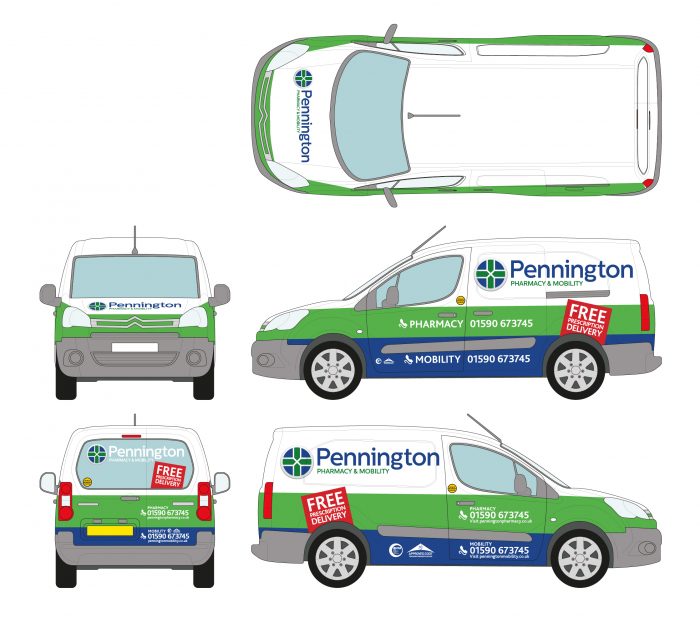
2. Half Wrap – either top, bottom, front or back is wrapped.
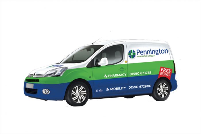
Pennington Pharmacy & Mobility – local pharmacy delivery
BRIEF: To build brand awareness locally for the combined pharmacy and mobility service, including contact details for both.
RESULT: We wrapped the bottom half of the vehicle, so it was instantly recognisable, fitted with the existing brand style and offered customers immediate reassurance.
3. Full Wrap – the entire vehicle can be wrapped including the roof, a great way to protect new vehicles from damaging stone chips.
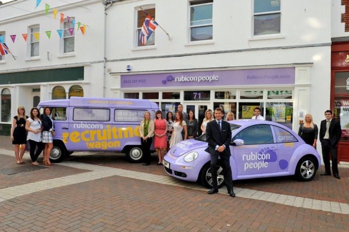
Rubicon Recruitment – small fleet of super cool vehicles for a professional recruitment team.
BRIEF: To build brand awareness and create a depth of commitment from a dynamic, young team with personality.
RESULT: The cool vehicle fleet warranted clear, distinct branding which fitted with their high street presence. Rubicon were thrilled with the result, their vehicles became instantly recognisable, eye catching and memorable amongst the target audience.
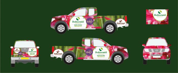
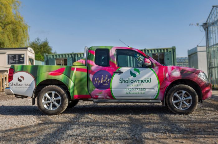
Shallowmead Nursery – Delivery truck for local wholesale and retail nursery.
BRIEF: To raise local awareness for retail nursery.
RESULT: A striking, instantly recognisable delivery truck.
